![]()
Client: Gentlemen Songsters
Service: Brand Identity, Design, Digital, Print
The Gentlemen Songsters are a long-established male voice choir based in the Black Country and they needed a new website design.
They approached TPSquared for a refresh to their brand, so it was vital to reflect the heritage and history of the choir.
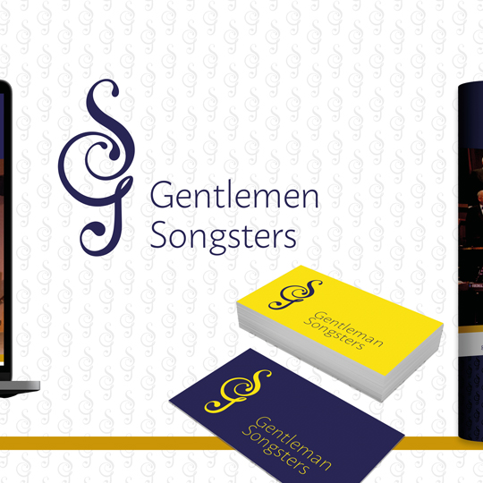
The inspiration for the logo came from the musical treble clef. Accordingly, we deconstructed and manipulated it to form the GS logo. On top of this, we added a clean, modern and very elegant font for the full name of the choir.
The bright yellow and strong blue colour palette compliment the new brand. This was influenced by the previous branding to keep a recognisable consistency. We also added a rich gold to represent heritage and quality.
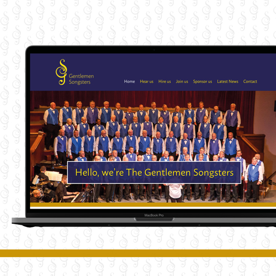
The Gentlemen Songsters needed a brand new website. Additionally, it also had to include the capability of advertising and selling tickets for their upcoming concerts. Similarly, they wanted to add news stories and up to date information. The website design also required a member’s area and the sections Hear Us, Hire Us, Join Us, Sponsor Us. All of these pages were something to encourage interaction and future promotion of the choir.
We developed a totally refreshed site design. This included striking images and clear navigation to make the user experience simple on both desktop and mobile devices.
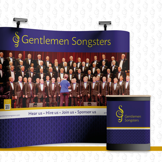
Another requirement for the rebrand was to design and produce an exhibition stand and some pull up displays. The choir would take these with them for use at concert venues and promotional events. The quality of the stand design fully matched the new logo and imagery. And, of course, this also reflected the quality of the choir!
The client was very happy with the quality and attention to detail of the design, which respected the values and history of the choir.
https://gentlemensongsters.com/