![]()
Client: The South Staffordshire Learning Partnership
Service: Brand Identity, Design, Digital, Print
Brand Development for South Staffordshire Learning Partnership
The South Staffordshire Learning Partnership (SSLP) is a network of five schools in South Staffordshire, providing education from nursery to sixth form. The partnership was previously known as Codsall High Federation of Schools. The SSLP recognised the need for a distinctive brand to represent the collective vision of the partnership, as well as to ensure consistency in all their marketing and advertising activity. Through a competitive tender process TPSquared was selected to develop the brand and logo for the Partnership.
Project Objectives
The project had several objectives, which included:
Logo and Strapline – Development of a distinctive and memorable logo that would resonate with a broad set of audiences to clearly articulate who the Partnership is. The logo would be used on all communications, both print and digital media.
Brand Identity – The brand identity should be vibrant, relatable to a wide audience, and inspire trust. It should also reflect the overarching vision of delivering a world-class education – from nursery to sixth form.
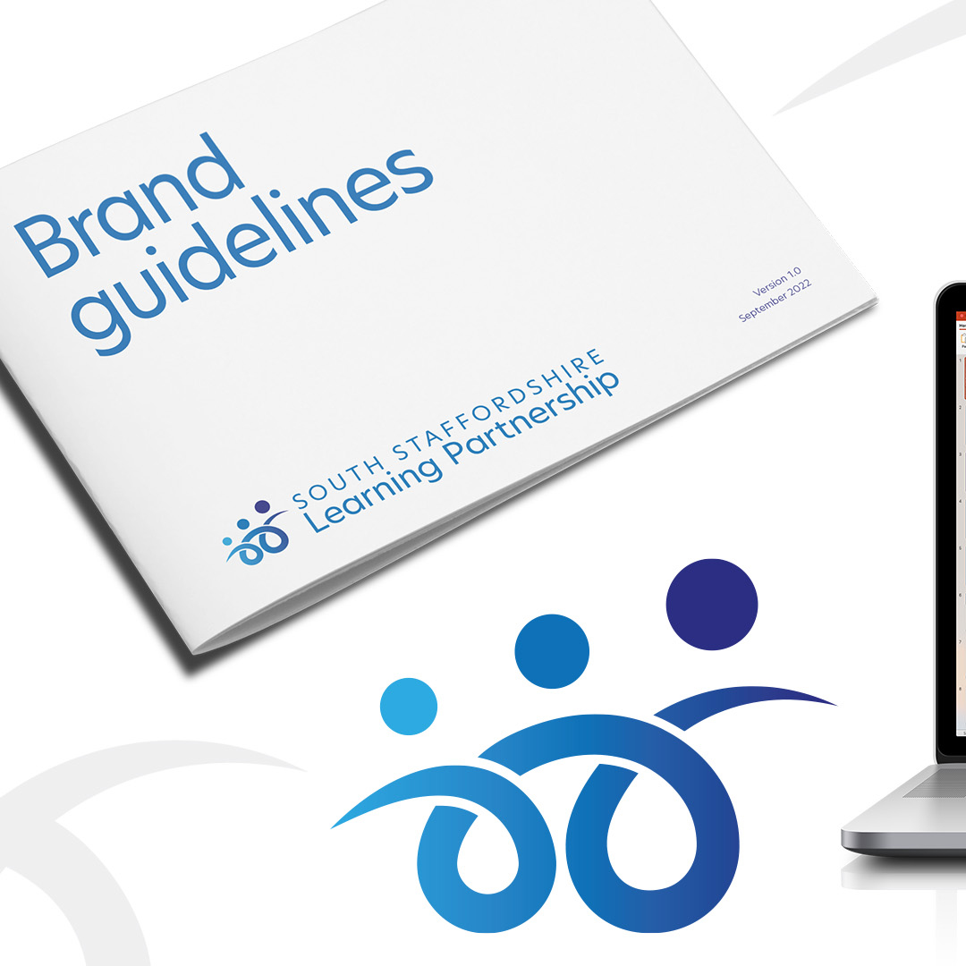
Brand Guidelines – Production of a set of branding guidelines that reflect a concise set of rules which protect the look and feel of the brand.
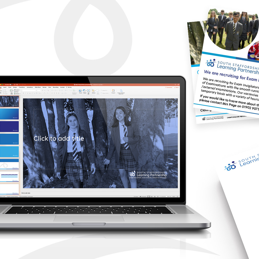
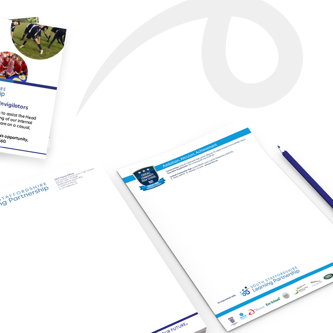
Stationery Suite – Creation of easy-to-use, shareable templates that could be adapted across a suite of printed and digital documents.
Signage – Development of external signage for the Head Office location.
Design Process
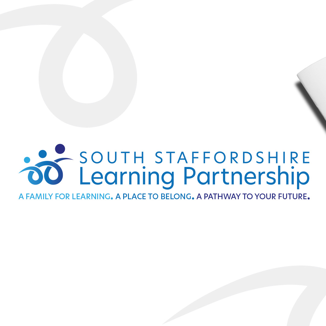
From an initial four concepts, TPSquared collaborated closely with the SSLP team to refine the final logo and the chosen brand development concept. The final logo features a stylised image of people, representing the 3 tier education system – First, Middle and High School. The logo is accompanied by the strapline “A Family For Learning. A Place To Belong. A Pathway To Your Future.” which embodies the Partnership’s vision of delivering a world-class education.
The colour palette features 3 shades of blue. First School – Sky blue representing open spaces, freedom, intuition, imagination, inspiration and sensitivity. Middle School – Blue representing stability, calm, harmony, unity, trust, truth and confidence. High School – Dark blue representing integrity, knowledge, power and seriousness. The typography is clean and modern, conveying a sense of professionalism and approachability.
The brand guidelines provide a set of rules to protect the look and feel of the brand, ensuring consistency across all marketing and advertising activity. The guidelines include rules for logo usage, colour usage, typography, and imagery.
The stationery suite includes easy-to-use, shareable templates for a range of printed and digital documents, such as letterheads and email signatures. The templates are designed to be flexible, allowing each school within the Partnership to customise the templates to suit their specific needs.
Finally, the external signage for the Head Office location features the new logo prominently, providing a clear visual representation of the Partnership’s brand identity.
Conclusion
The new brand identity and logo developed by TPSquared for the South Staffordshire Learning Partnership is a clear and memorable representation of the Partnership’s vision of delivering a world-class education. The brand identity is designed to reflect the Partnership’s commitment to providing an inclusive and welcoming learning environment. The brand guidelines and stationery suite provide a set of rules to ensure consistency across all marketing and advertising activity. The external signage provides a clear visual representation of the brand identity, ensuring that the Partnership’s brand is visible and recognisable to all.