Graphic design tips for non-designers and beginners
With three well-seasoned graphic designers in our team, making things look good comes easily – we’re experts in our game. From font pairing and creating beautiful colour palettes, to alignment and embracing white space, we know what it takes to get the best results out of graphic design – like riding a bike, once you learn, you never forget.
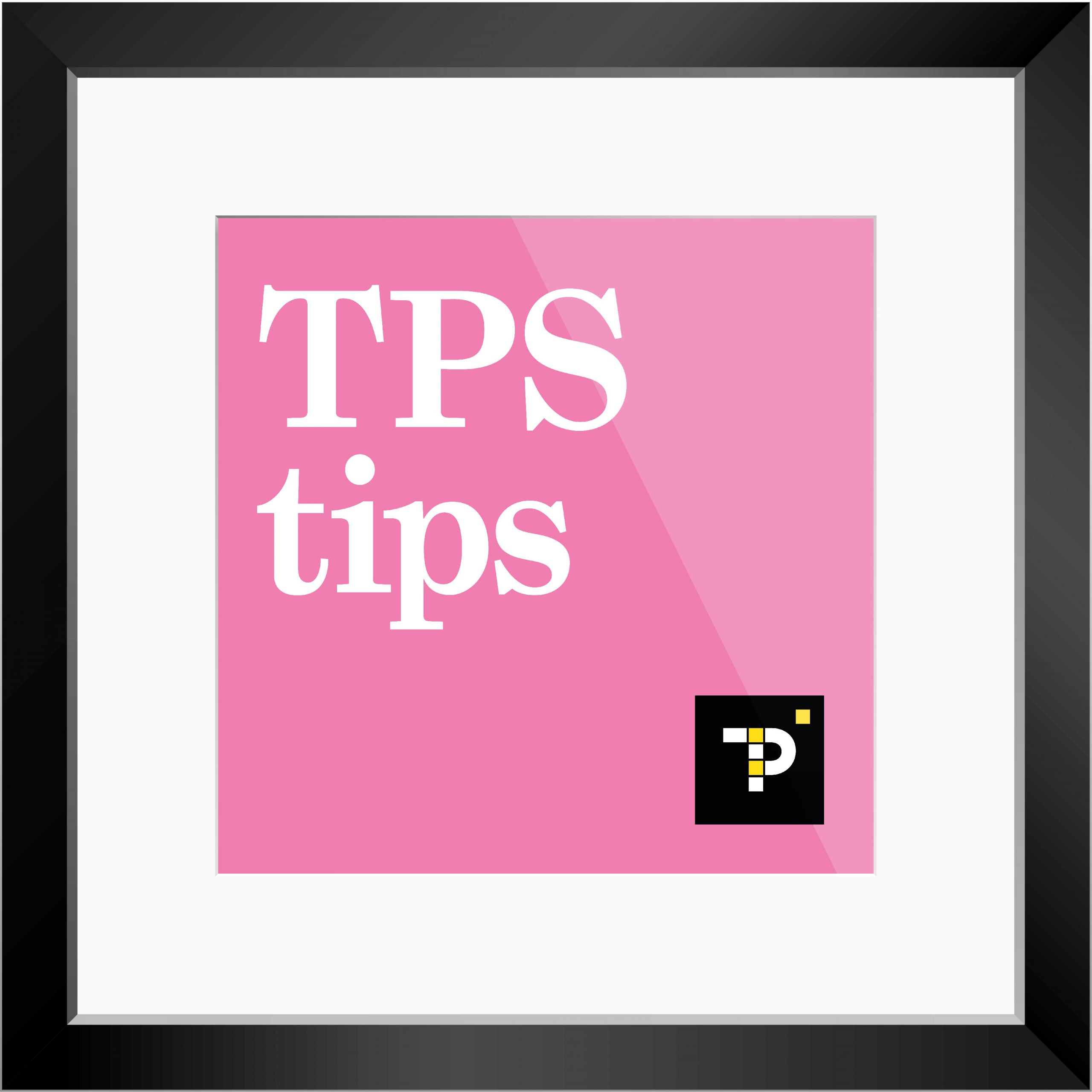
Back in October 2020, we shared a series of useful design tips, ‘TPS tips’. We see a lot of great ideas that don’t always come together as well as they could, and it makes us a little sad to see bad kerning and a poorly-aligned layout. So, we thought we would share some little nuggets of advice, to help out all our non-designer friends and the aspiring graphic designers out there.
The facets of the design world are complex but, with a little help from us, it will all fall into place.
Here are our first six TPS tips, with links to some great websites:
1. Create a great colour palette 🎨
Most of the best designs use beautiful colours and choosing a suitable palette is key.
If you have a good eye for colour, this is a great process for planning. There are some really useful sites out there to help.
color.adobe.com/create/color-wheel
canva.com/colors/color-meanings/
2. Create a moodboard 💡
Creating a moodboard (or inspiration board) helps you establish the basics of what the end result could ideally look like. It is intended to evoke or project a particular style or concept.
canva.com/learn/make-a-mood-board/
creativebloq.com/graphic-design/mood-boards-812470
milanote.com/guide/create-better-moodboards
3. Embrace white space 🤍
Often neglected, one of the most vital aspects of design is white space (or negative space), the space found inside and surrounding the other design elements. It is intended to emphasise elements and/or to convey a specific mood.
blog.bannersnack.com/white-space-in-graphic-design
artworkabode.com/…/graphic-design-and-the-power…/
blog.tubikstudio.com/negative-space-in-design…/
4. Limit the number of fonts you use ⛔️
When starting a new design, it’s a good idea to experiment and find the perfect style font for the specific project you’re working on.
The eye finds it hard to scan multiple typefaces, so stick to a simple collection of fonts. Limit yourself to pairing two fonts in your design. Better yet, choose a single font family, with a large variation in weights and styles, so you can be sure that the fonts you pair up will be complementary to one another.
creativelive.com/blog/typography-tips/
canva.com/learn/typography-guide/
creativemarket.com/blog/typography-rules
5. Alignment ⌖
Alignment is a dedicated art. This essential design principle helps you create order and hierarchy in your designs – resulting in beautiful and easy-to-read layouts.
canva.com/learn/the-art-of-alignment/
designmantic.com/blog/art-of-alignment-graphic-design/
blog.thepapermillstore.com/design-principles-alignment/
6. Contrast ◉
Contrast is an important design principle that should be a part of every project. It helps to organise and establish a hierarchy to show which parts of your design are the most important, and signals viewers to focus on those. Good use of contrast adds visual interest and spices things up.
canva.com/learn/contrasting-colors/
lifewire.com/create-contrast-with-obvious-differences-1077469
visme.co/blog/visual-hierarchy/
We’ve really enjoyed sharing these graphic design tips. Just follow these simple steps and you’ll be well on your way to creating some fantastic designs. Keep your eyes peeled for series two!
TPSquared Limited
Gravel Hill House
Gravel Hill
Wombourne
Wolverhampton
WV5 9HA
☎️ 01902 356280
💻 hello@tpsquared.co.uk
Subscribe to our blog to be notified when we publish new content
