Client: Dudley Building Society
Service: Design
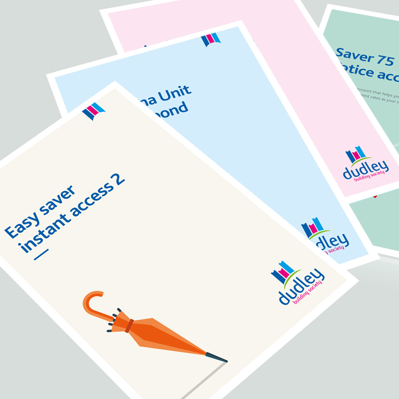
A project to provide a new design for marketing materials is always a challenge. So, when TPSquared were tasked by Dudley Building Society to review a number of items promoting a range of savings and investment accounts, we met the challenge head on. We needed to develop a new look and feel for a variety of their marketing literature, so we went to work.
Our studio used a combination of delightful, contemporary design and engaging, brand-consistent and yet fun graphics. We added all of this into the mix to visually represent each specific product. This made them immediately identifiable and far more intriguing.
We included tables to list the various key facts and figures to make the marketing material far more engaging. As a result, this allowed the reader to quickly and clearly digest the key points we needed them to read. The design and layout also gave the text space. This helps the look and feel of the marketing materials, and also it doesn’t put customers off from actually reading the product specific information.
A business brand is vital to how they appear in the busy marketplace. To employ a set of brand guidelines, and a consistent design for marketing materials, is key to acheiving this goal.
dudleybuildingsociety.co.uk


