Mind the Gap: Why White Space Isn’t Wasted Space
Ever looked at a website, email or any kind or sales, advertising or marketing material and thought, “Ahhh… that’s a breath of fresh air”? Chances are, it wasn’t just the colour palette or carefully curated fonts, it was the white space doing its magic.
Yep, white space. Also known as “negative space,” “breathing room,” or “the bits designers leave blank on purpose.” But let’s set the record straight: white space isn’t empty. It’s powerful. It’s persuasive.
According to Mailchimp (who know a thing or two about good-looking emails), white space helps content feel more “digestible and scannable.” In other words, your audience won’t run for the hills when they see a wall of text. Instead, they’ll actually read what you’re saying. Shocking, we know.
Here at TPSquared, we see white space as the design world’s equivalent of a good pause in conversation. The kind that gives your big ideas time to breathe, rather than crowding them in like commuters on a rush hour train.
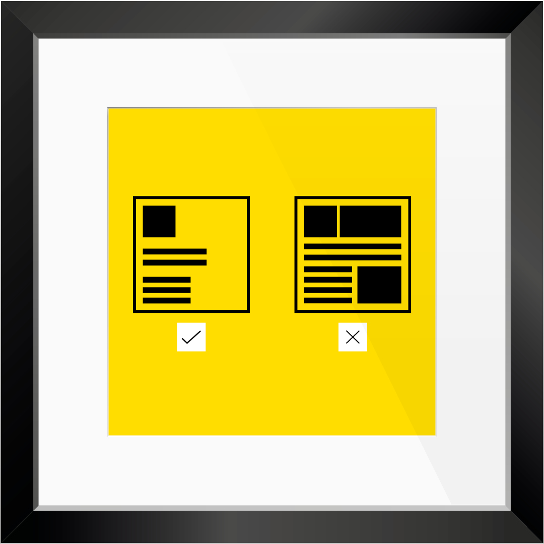
But it’s not just about making things look pretty. Elementor, our friends in the land of intuitive website design tools, explain that white space “guides the user from one element to another” and increases comprehension by up to 20%. That’s not a teeny stat. That’s your homepage doing a victory lap because visitors are actually engaging.
And it gets even better: white space isn’t just a design flex, it’s an accessibility win. For people with dyslexia, visual impairments or cognitive processing issues, cluttered layouts can be an absolute nightmare. Proper spacing around text, between lines and across sections helps everyone navigate your content more comfortably. According to accessibility guidelines, clear contrast, line spacing and generous margins aren’t just nice to have, they’re essential. Inclusive design = better design. Full stop.
“But wait,” we hear you cry. “Won’t all that space make my design look… sparse?”
Enter Adobe. Their formatting bible (which yes, we have bookmarked) reminds us that when it comes to paragraphs and layouts, white space can be a key part of hierarchy, nudging the reader’s eye toward what matters most.
The trick is in the balance. Too much space and your design might float away into minimalist oblivion. Too little and you risk triggering flashbacks to GCSE revision guides. (You remember the ones. Text everywhere. No mercy.)
At TPSquared, we use white space not as an afterthought, but as a strategic design tool. Whether we’re designing websites, crafting your brand story or giving your packaging a facelift, we make sure every pixel has a purpose, even the ones that don’t say anything.
So the next time someone points at a beautifully spaced-out layout and says, “Isn’t that a bit empty?” or “that’s a bit simple”, you can smile sweetly and say, “Nope, that’s intentional breathing room, bab.”
Ready to give your brand space to shine? Get in touch. We’ll help you master the art of saying more… with less.
TPSquared Limited
Gravel Hill House
Gravel Hill
Wombourne
Wolverhampton
WV5 9HA
☎️ 01902 356280
💻 hello@tpsquared.co.uk
Subscribe to our blog to be notified when we publish new content