The Importance of Accessibility in Design
How would you feel if you couldn’t read information clearly and quickly?
According to the UK Government, 1 in 5 people have a disability in our country. This could be anything from a visual to hearing impairment, to a disability that affects fine movement (motor) or a person’s memory and thinking (cognitive).
Taking into consideration all abilities, circumstances and environments helps to shape an accessible world. By prioritising inclusive design, you create communications accessible to everyone. This enhances user experience, boosts customer satisfaction, and expands your reach.
If you choose to shy away from implementing accessibility practices into your design and marketing, this means you’ll be excluding a significant portion of potential users, which is not only ethically problematic but also bad for business. Let’s do it right, first time!
Did you know, all public sector bodies must meet accessibility requirements of the Equality Act 2010 and the Disability Discrimination Act 1995?
As a business owner or marketing team, you’re responsible for ensuring all your communications, products and services, can be accessed by all – regardless of ability or disability. Don’t worry, we’ve got you covered!
Practical tips for designing with accessibility in mind.
Typography
- When considering your typeface (font), keep it simple! Highly stylised fonts that don’t lend themselves to enough spacing between letters can cause people with dyslexia to experience a type of visual distortion.
- Choose a sans-serif font like Arial, Calbri, Verdana or Tahoma which are easier to read.
- Use font size 12pt to 14pt. For visually impaired users, increase the font size to at least 18pt.
- Increased line spacing within your work can enhance readability.
- Limit how many fonts and fonts variations (different weights such as Bold, Medium, Semi Bold) you use, and try not to use italics as this can make text very difficult to read, especially for people with dyslexia.
- Don’t use the underline feature unless it’s to show a link.
- Avoid using blocks of capital letters as this makes the text much harder to read.
Language and writing style
- Write in plain English with short, clear sentences and paragraphs.
- Use everyday words and avoid jargon, slang and figures of speech that won’t be familiar to your audience.
- Stay away from words with hyphens and uncommon punctuation. Consider adding a glossary for any terms readers might not know.
Colour
- Use colour combinations that offer sufficient contrast.
- Avoid black text on a white background and instead use an off-white or pale pastel coloured backgrounds that reduce glare.
- Steer away from using colour combinations that feature tints of the same colour.
- Consider your website and how the colours you use on screen work with one another by checking the contrast. UK charity, Scope, presents some additional information on the topic which can come in handy with this exercise.
Design and layout
- When considering your layout, apply best practice by aligning your text to the left without justification and avoid having multiple columns.
- White space is a good space! It helps remove clutter near text.
- Be sure to make use of headings in the appropriate way. For web accessibility, headings are usually ranked from ‘Heading 1’ to ‘Heading 6’. Organisations like Scope offer useful guidance on why heading tags are important for website accessibility.
- Keep paragraphs brief and break up long passages with short sentences, bullet points and tables.
Images and iconography
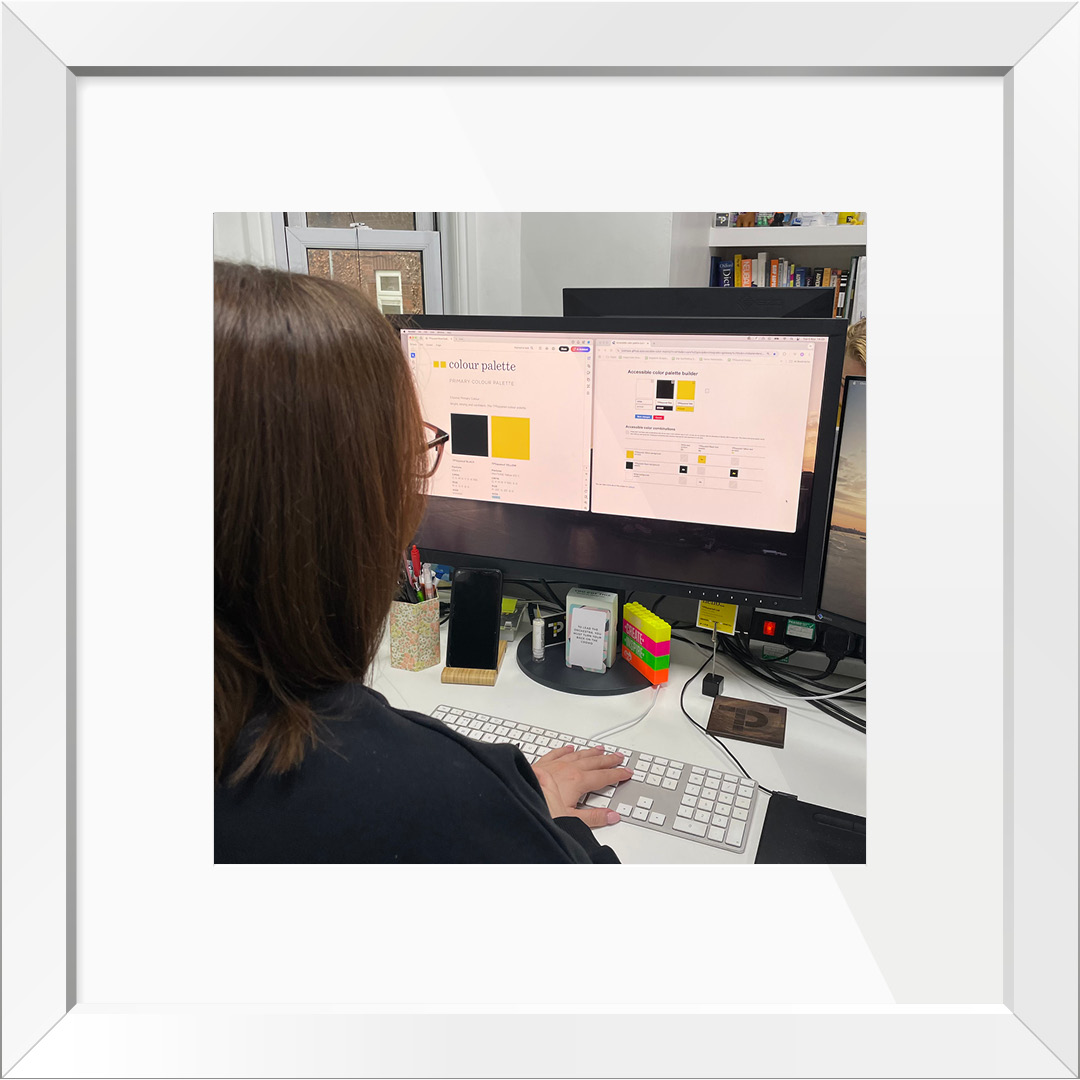
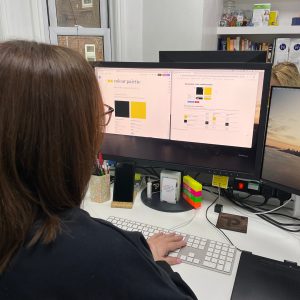
- Add alt-text to your images online that describe what’s going on in the image accurately. For example: A person with shoulder-length brown hair and glasses is seated at a desk, working on a computer with two large monitors. The screens display a colour palette selection and an accessible colour palette builder. The desk has a keyboard, a smartphone on a stand, stationery, and colourful labelled blocks. In the background, there are bookshelves, office supplies, and another person partially visible behind the monitors.
- Images should be clear and purposeful.
- Use relevant photos, icons, diagrams, or illustrations to complement written descriptions.
- Avoid using animated GIFs or flashing images to prevent distractions or accessibility issues.
Start designing for accessibility today
Remember, designing for accessibility is not just about compliance; it’s about creating a world where everyone can participate. Make accessibility a priority in your next project and help pave the way for a more inclusive future.
Everyone loves a freebie!
To download our free TPSquared Toolkit on Accessibility Design Principles for your office, click here.
We hope these tips and insights have provided you with some considerations that you can implement.
But if it’s out of your comfort zone and you’d like some support and guidance, let’s grab a cuppa and have a chat to see how we can help shape your brand with accessibility design principles.
Get in touch today.
TPSquared Limited
Gravel Hill House
Gravel Hill
Wombourne
Wolverhampton
WV5 9HA
☎️ 01902 356280
💻 hello@tpsquared.co.uk
Subscribe to our blog to be notified when we publish new content