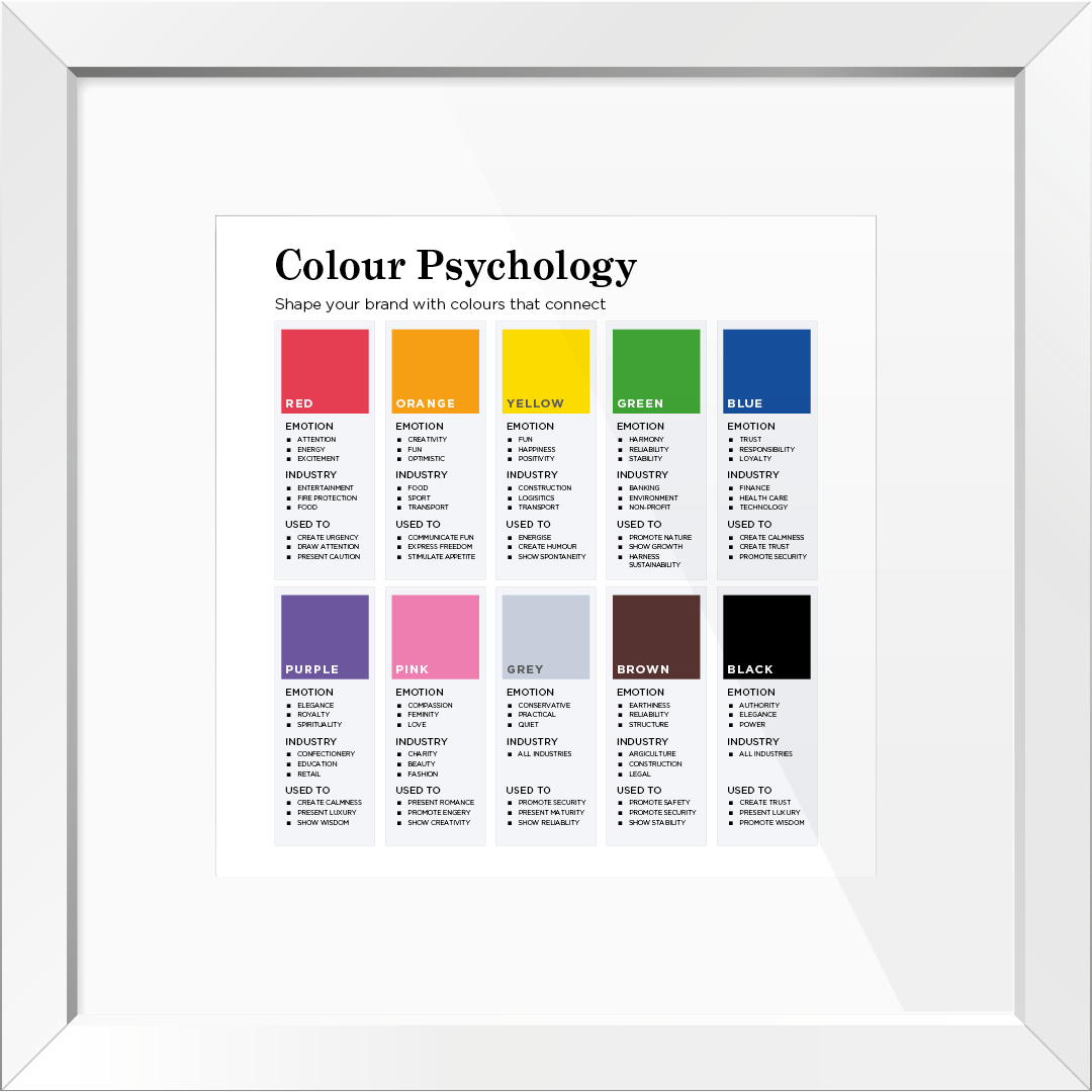
Colour Psychology: Shape your brand with colours that connect
At TPSquared, we never underestimate the importance of colour. Using colours in the right way, at the right time can effectively increase brand awareness and influence customer behaviour.
Let’s look at the psychological impact of colours in branding and how you can strategically use your palette to shape audience perceptions.
Influence your audience
Incorporating specific colours into visual identities can improve brand recognition by up to 80%. By understanding the emotional associations evoked by different colours enables businesses to effectively communicate their message and establish a memorable presence.
At TPSquared, we spend time considering a brand’s colour palette and how colours bring on emotions, but most importantly, how they can enhance customer engagement and drive business success through marketing materials.
Recall and colour
Did you know, customers are 81% more likely to recall a brand’s colour than remember its name, highlighting the importance of colour in brand recognition and recall.
In today’s environmentally conscious world, the colour green is commonly used to advertise and promote non-profit activities and is used within the banking sector and environment agencies. The colour is extremely useful at promoting nature, presenting growth and harnessing sustainability.
An example of a brand that uses the colour green and one that has been around for hundreds of years is Lloyds. Lloyds, who worked with global brand consultancy Wollf Olins to refresh their brand for the future, retained their use of the colour green and introduced new shades of the colour too. Interested in this story? Check out what they’ve got to say here. This is one of Harriet’s top design ‘crush’ projects of 2024 – she loves to keep an eye on Wollf Olins and the projects they’ve worked on.
Looking to create a sense of urgency? The colour red is most often used to display call-to-actions such as emergency notices or promotional discounts in retail stores, which helps to draw people’s attention quickly.
Financial services, healthcare and technology services often use the colour blue, which is associated with trust and used to create a sense of calm, as well as promoting the feeling of security. It can make a product instantly recognisable and leave a long-lasting impression – think of organisations like NHS, Barclays, Dell.
By understanding and choosing the right colours, a brand can drive positive action and businesses can help develop their place within their industry.
Consistency makes a difference
Think about your favourite brands and what it is that makes you recognise them? Brands that present themselves consistently are 3-4 times more likely to achieve strong visibility. From stimulating an appetite to creating humour, showing creativity and promoting wisdom, different colours can help support brand messaging, tone of voice and reputation in various ways, and by understanding their importance, you’ll be ahead of the game of your competition.
Everyone loves a freebie!
To download our free colour psychology poster for your office, click here.
Get in touch for your free 30-minute brand colour psychology consultation where we’ll review your:
🟨 current brand colour palette
🟨 the emotions it evokes
🟨 plus more…
Let’s talk to start to shaping your brand with colours that connect today.
TPSquared Limited
Gravel Hill House
Gravel Hill
Wombourne
Wolverhampton
WV5 9HA
☎️ 01902 356280
💻 hello@tpsquared.co.uk
Subscribe to our blog to be notified when we publish new content

